


The Welcome Banner feature in ZenCommunity enables site owners to display dynamic banner content based on a user’s authentication status. Using this feature, you can present customized welcome titles, descriptions, images, or videos separately for logged-in users and logged-out (guest) users, creating a more personalized and engaging user experience.
This flexibility helps guide users more effectively—whether welcoming new visitors, encouraging sign-ups, or sharing important updates and announcements with existing community members.
Step 1: Accessing the Welcome Banner Feature
In the ZenCommunity settings, you can find the Welcome Banner option under the main menu. Clicking on the Welcome Banner menu will open the configuration interface, where you can manage and customize the banner content.
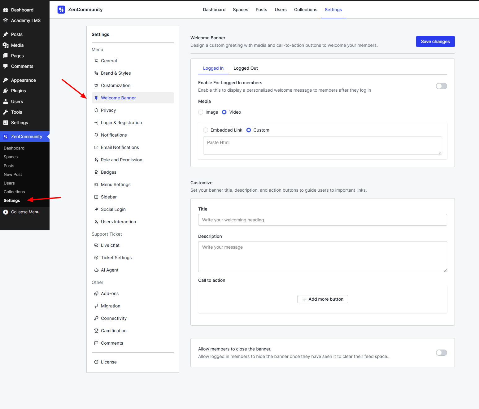
Welcome Banner Options
On the Welcome Banner page, you will find two configuration options:
- Logged In: Configure the welcome banner specifically for logged-in users.
- Logged Out: Set up the welcome banner for logged-out (guest) users.
Each option can be customized independently based on your requirements.
Logged-In Welcome Banner Settings
On this page, you will find the Enable For Logged-In Members option. You can enable or disable it according to your needs.
- If enabled: Logged-in users will see your custom welcome banner, including any images, videos, or other content you have set up.
- If disabled: The welcome banner will not be displayed to logged-in users.
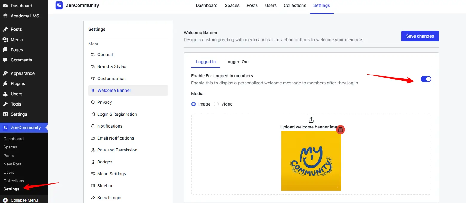
Media: In this section, you can choose the type of content to display in the welcome banner:
- Image: Select this option and upload an image if you want logged-in users to see a custom image in their welcome banner after logging in.
- Video: Select this option and upload a video if you want logged-in users to see a custom video in their welcome banner after logging in.
These options help you create a more engaging and personalized experience for your members.
Customization
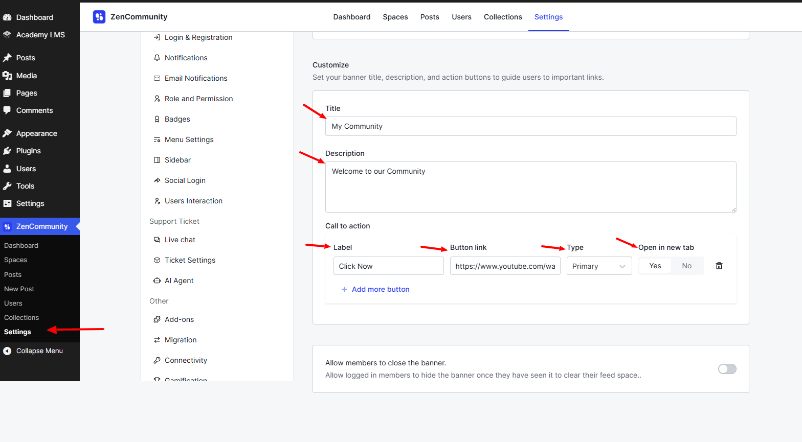
In this section, you can customize the welcome banner by adding a title, description, and action buttons.
Adding an Action Button
To add a button:
- Click the “Add Button” option under the “Call to Action” section.
- This will open the “Create Button” page, where you can configure:
- Button Label (Name): Text displayed on the button
- Button Link: URL the button will redirect to
- Button Type: Style or type of the button
- Open in New Tab: Choose whether the link opens in a new browser tab
- Button Label (Name): Text displayed on the button
This allows you to create a fully interactive and actionable welcome banner for your users.
Note: You can add multiple buttons to the welcome banner if needed.
Once all configurations are complete, click the Save Changes button to save your settings.
Step 2: Hide Welcome Banner (User Control)
Lastly, you’ll find the “Allow members to close the banner” option. When enabled, it allows logged-in users to hide their welcome banner if they choose.
Note: This feature is available only for logged-in users and does not apply to logged-out (guest) users.
Please note: The configuration options for logged-out users are largely the same as those for logged-in users. However, the “Allow Members to Close the Banner” option is available only for logged-in users and is not applicable to logged-out (guest) users.
How It Appears for Logged-In and Logged-Out Users
Both logged-in and logged-out users can see the welcome banner in the Community Feeds, exactly as configured by the community admin.
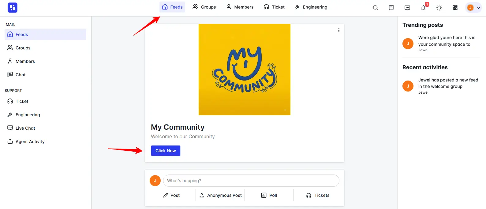
The ZenCommunity Welcome Banner feature provides a flexible and powerful way to communicate with both logged-in and logged-out users. By displaying tailored content based on a user’s authentication status, community admins can deliver more relevant messages, improve user engagement, and guide members effectively throughout their journey.